PMT Pulse analysis
Jelle, updated May 2019
updated Feb 2022 by Joran
Standard python setup:
[1]:
import numpy as np
from tqdm import tqdm
import matplotlib.pyplot as plt

# This just ensures some comments in dataframes below display nicely
import pandas as pd

pd.options.display.max_colwidth = 100
After this standard setup, we can load straxen:
[2]:
import strax
import straxen

st = straxen.contexts.xenonnt_online()
straxen.print_versions()
cutax is not installed
[2]:
| module | version | path | git | |
|---|---|---|---|---|
| 0 | python | 3.10.0 | /home/angevaare/miniconda3/envs/dev_strax/bin/python | None |
| 1 | strax | 1.1.7 | /home/angevaare/software/dev_strax/strax/strax | branch:master | db14f80 |
| 2 | straxen | 1.2.8 | /home/angevaare/software/dev_strax/straxen/straxen | branch:master | 024602e |
Raw records
Let’s select a run for which we have strax data.
[3]:
dsets = st.select_runs(
    available="raw_records",
)
run_id = dsets.name.min()
run_id
[3]:
'008334'
[4]:
st.storage
[4]:
[straxen.storage.rundb.RunDB, readonly: True,
 strax.storage.files.DataDirectory, readonly: True, path: /dali/lgrandi/xenonnt/raw, take_only: ('raw_records', 'raw_records_he', 'raw_records_aqmon', 'raw_records_nv', 'raw_records_aqmon_nv', 'raw_records_aux_mv', 'raw_records_mv'),
 strax.storage.files.DataDirectory, readonly: True, path: /dali/lgrandi/xenonnt/processed,
 strax.storage.files.DataDirectory, path: ./strax_data]
This run is one hour long, so the full raw waveform data won’t fit into memory. Let’s instead load only the first 30 seconds:
[5]:
rr = st.get_array(run_id, "raw_records", seconds_range=(0, 30))
convert_channel::       changed channel
convert_channel::       changed channel
convert_channel::       changed channel
convert_channel::       changed channel
convert_channel::       changed channel
convert_channel::       changed channel
The rr object is a numpy record array. This works almost like a pandas dataframe, in particular, you can use the same syntax you’re used to from dataframes for selections.
Here are the fields you can access:
[6]:
st.data_info("raw_records")
[6]:
| Field name | Data type | Comment | |
|---|---|---|---|
| 0 | time | int64 | Start time since unix epoch [ns] |
| 1 | length | int32 | Length of the interval in samples |
| 2 | dt | int16 | Width of one sample [ns] |
| 3 | channel | int16 | Channel/PMT number |
| 4 | pulse_length | int32 | Length of pulse to which the record belongs (without zero-padding) |
| 5 | record_i | int16 | Fragment number in the pulse |
| 6 | baseline | int16 | Baseline determined by the digitizer (if this is supported) |
| 7 | data | ('<i2', (110,)) | Waveform data in raw ADC counts |
You now have a matrix (record_i, sample_j) of waveforms in rr[‘data’]:
[7]:
rr["data"].shape
[7]:
(3046781, 110)
Let’s select only records that belong to short PMT pulses. These are mostly lone PMT hits. Longer pulses are likely part of S1s or S2s.
[8]:
rr = rr[rr["pulse_length"] < 110]
Here’s one record:
[9]:
def plot_record(sample_r):
    plt.plot(sample_r["data"][: sample_r["length"]], drawstyle="steps-mid")
    plt.xlabel("Sample number")
    plt.ylabel("Amplitude (ADCc)")


sample_r = rr[0]
plot_record(sample_r)
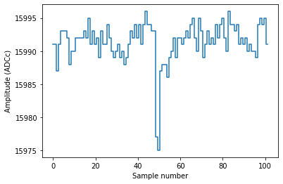
As you can see, this record contains a single PE pulse, straight as it comes off the DAQ. No operations have been done on it; we did not even subtract the baseline and flip the pulse.
Each record is 110 samples long, but this digitizer pulse was only 102 samples long:
[10]:
sample_r["pulse_length"]
[10]:
102
and thus the pulse has been zero-padded:
[11]:
sample_r["data"]
[11]:
array([15991, 15991, 15987, 15991, 15993, 15993, 15993, 15992, 15988,
       15990, 15990, 15992, 15992, 15992, 15992, 15993, 15992, 15995,
       15991, 15993, 15991, 15992, 15989, 15993, 15991, 15991, 15994,
       15992, 15990, 15989, 15990, 15991, 15989, 15990, 15988, 15989,
       15991, 15993, 15992, 15994, 15992, 15994, 15991, 15994, 15996,
       15994, 15994, 15993, 15993, 15977, 15975, 15987, 15988, 15988,
       15986, 15989, 15990, 15992, 15989, 15992, 15992, 15991, 15992,
       15993, 15992, 15994, 15995, 15992, 15990, 15995, 15993, 15989,
       15991, 15993, 15991, 15992, 15991, 15994, 15992, 15994, 15995,
       15992, 15990, 15996, 15994, 15994, 15993, 15994, 15991, 15992,
       15991, 15992, 15990, 15991, 15990, 15990, 15989, 15994, 15995,
       15994, 15995, 15991,     0,     0,     0,     0,     0,     0,
           0,     0], dtype=int16)
Let’s take care of the baseline and zero padding:
[12]:
# Convert from raw_records to the records datatype, which has more fields.
# Without this we cannot baseline.
rr = strax.raw_to_records(rr)

# Subtract baseline and flip channel
strax.baseline(rr)
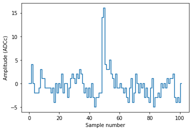
Now things look more reasonable:
[13]:
plot_record(rr[0])
Pulse shape
Let’s focus on channel 100:
[14]:
r = rr[rr["channel"] == 100]
Here is the distribution of amplitudes in each sample. This is very roughly the mean pulse shape:
[15]:
ns = np.arange(len(r[0]["data"]))

plt.plot(ns, r["data"].mean(axis=0), drawstyle="steps-mid")
plt.fill_between(
    ns,
    np.percentile(r["data"], 25, axis=0),
    np.percentile(r["data"], 75, axis=0),
    step="mid",
    alpha=0.3,
    linewidth=0,
)
plt.xlabel("Sample in record")
plt.ylabel("Amplitude (ADCc)")
[15]:
Text(0, 0.5, 'Amplitude (ADCc)')
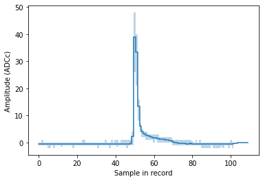
You can clearly see we’re dealing with single PEs here, and also see the infamous long PE pulse tail. For a serious pulse shape study you should of course first normalize the pulses.
Gain calibration
[16]:
run_id
[16]:
'008334'
Let’s integrate between sample 40 and 70, to get the mean single-PE area. We have to add a small correction for the baseline, see here for details. Usually this is done inside strax and you don’t have to worry about it.
[17]:
left, right = 40, 70
areas = r["data"][:, left:right].sum(axis=1)

# Small correction for baseline, see strax issue #2
areas += ((r["baseline"] % 1) * (right - left)).round().astype(np.int64)

# Hack to get ADC -> PE conversion factors. We'll make this better someday...
to_pe = st.get_single_plugin(run_id, "peaklets").to_pe

plt.hist(areas, bins=100)
plt.xlabel("Area (ADCc)")
plt.ylabel("Counts")
plt.axvline(1 / to_pe[100], color="r", linestyle="--")
plt.axvline(np.median(areas), color="purple", linestyle="--")
[17]:
<matplotlib.lines.Line2D at 0x7fb99a612950>
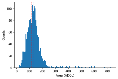
The purple line is an extremely bad gain estimate (the median area) of pulses, which nonetheless comes close for this PMT. It should be obvious this is a bad method: it takes no account of 2PE hits or the hitfinder efficiency at all.
The red line indicates where the 1 PE area should be according to the XENON1T gain calibration. Looks like the gain is, at least approximately, correct!
Let’s do the same for all PMTs:
[18]:
areas = rr["data"][:, 40:70].sum(axis=1)
channels = rr["channel"]

gain_ests = np.array(
    [np.median(areas[channels == pmt]) for pmt in tqdm(np.arange(straxen.n_tpc_pmts))]
)
  2%|▏         | 12/494 [00:00<00:16, 29.33it/s]/home/angevaare/miniconda3/envs/dev_strax/lib/python3.10/site-packages/numpy/core/fromnumeric.py:3440: RuntimeWarning: Mean of empty slice.
  return _methods._mean(a, axis=axis, dtype=dtype,
/home/angevaare/miniconda3/envs/dev_strax/lib/python3.10/site-packages/numpy/core/_methods.py:189: RuntimeWarning: invalid value encountered in double_scalars
  ret = ret.dtype.type(ret / rcount)
100%|██████████| 494/494 [00:18<00:00, 27.23it/s]
[19]:
plt.scatter(1 / to_pe, gain_ests, s=2)
plt.plot([0, 250], [0, 250], c="k", alpha=0.2)
plt.xlabel("XENONnT gain calibration (ADCc)")
plt.ylabel("Median short pulse area (ADCc)")
plt.title("Pulse areas in ADCc for each PMT")
plt.xlim(left=0)
plt.ylim(bottom=0)
plt.gca().set_aspect("equal")
/tmp/jobs/17887550/ipykernel_29675/2656599034.py:1: RuntimeWarning: divide by zero encountered in true_divide
  plt.scatter(1/to_pe, gain_ests, s=2)
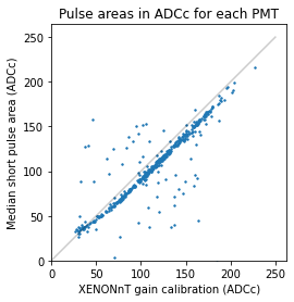
As you can see, even this extremely basic method (median area of short pulses in 30sec of background data) gives a somewhat plausible gain estimate for most PMTs.